Friday, January 22, 2010

tutorials


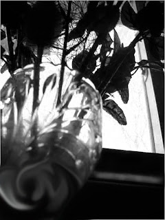
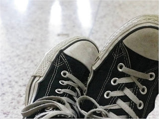
step one: make your selection by using the quick selection tool and selectiong the part of the picture you want to coppy. (i flipped the picture so it would be at a different angle)
Step two: feather your selection so your image doesnt look cut out. you can feather an image by going to selection then modify then feather, the higher the number the more the selection will be feathered.
step three: coppy and paste your selection onto your second image.
step four: go to edit and free transform to move your selection and change the size or shape.
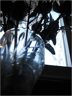
step five: you can edit your second picture by selecting that level. in this picture i made it black and white. then i used the smudge tool to make the swirl effect on the vase because the color was very pixilated. this gives it a more surreal feeling and overall makes it a stronger picture.
step six: merge the two layers together and save your final image!

Thursday, January 21, 2010

Superstitions...

i was sitting around trying to think of ideas for my series and my friend kept playing with the salt. it reminded me of the superstition, if you spill salt you have to take a pinch and throw it over your shoulder. that's when i got the idea for superstitions and bad luck. i dumped out some of the salt onto the table and made a skull then set up my picture. that picture is my favorite because it is creative and captivating and aesthetically pleasing. the second picture is a broken mirror which is supposed to bring 7 years of bad luck. this is my second favorite picture because i like they mystery and the illusion of the picture. i also like the set up and the angle i chose. my third picture represents the superstition, opening an umbrella inside a house brings bad luck. my goals for photography in the future are to become better at making a strong connection with the viewer. i would like to take pictures that people want to look at for a long time. to captivate people with my photography and keep them enlightened would make me a better artist and photographer.


Thursday, January 14, 2010

color...

the color red is a bold color and that helps make this is a bold picture. red symbolizes love and so does the rose. i put the rose in the show because the strong contrast between the red and the white really makes the red brighter. my second picture is a skull made out of coffee beans. the color brown evokes a sense of strength ans reliability it also has a sense of warmth and comfort and it is down to earth. i think the coffee beans really add to this effect. my third picture is of a tree branch in the snow. i like this because white represents purity and innocence. that reminded me of fresh snow because it is so clean and pure.


scholarship opportunity


Tuesday, January 5, 2010

Monday, December 21, 2009

Andy Goldsworthy


the work of Andy Goldsworthy is absolutely amazing. he captures the natural movement and life of nature in his work. he is inspired by his surroundings and makes art out of it as well. he has so much patients and puts a great amount of time and effort into each piece. he spends hours making beautiful sculptures out of the things he finds around him. then he photographs it and his pictures are simple yet filled with extraordinary detail. in each piece he tries to understand the nature around him. each time he builds something and runs into a problem he feels he understands the material he is working with even more. and each time he rebuilds it gets a little higher. he makes each piece as a gift to nature.


Thursday, December 17, 2009